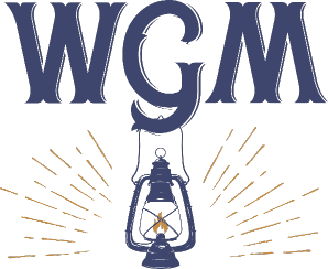
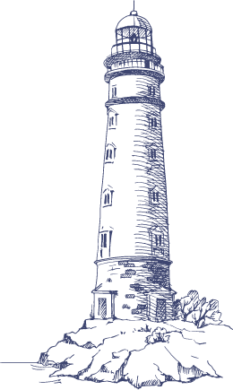
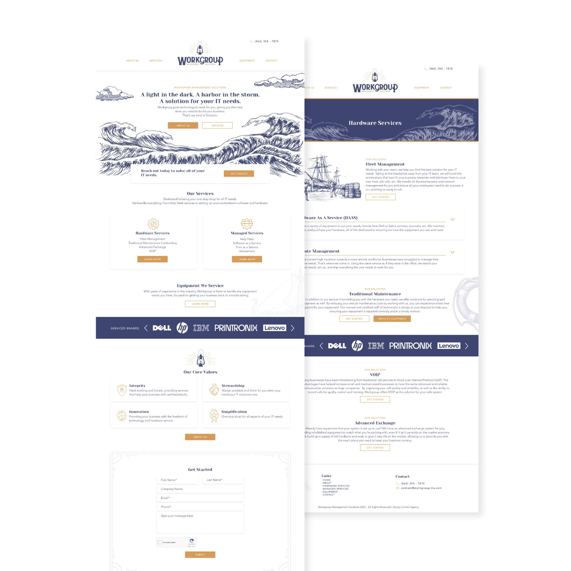
Workgroup Management Solutions came to us with an idea and their business goals, and we provided the rest. Looking for an illustrative style, similar to a vintage newspaper, to contrast with typical modern, blocky tech websites and the idea of a lantern guiding the way for his clients, we built the brand from the ground up. The client also mentioned a love of Viking design aesthetics, so implementing the lantern motif and adding the illustrative sea elements to push that idea further, with Workgroup being the lighthouse for its clients. To further reinforce the brand image, when approaching the shortened form of the logo with the company’s initials, the design team made sure to hang the lantern off the middle initial to keep that light in the viewer’s eye.