When potential customers visit your site, it is often their first impression of your business, and a good experience will set a good tone for their continued interaction with your brand. A good way to ensure a good and consistent experience is to use responsive web design, a design practice that has become pivotal in this fast-paced digital market. From smartphones and tablets to desktops and beyond, the significance of responsive web design cannot be overstated.
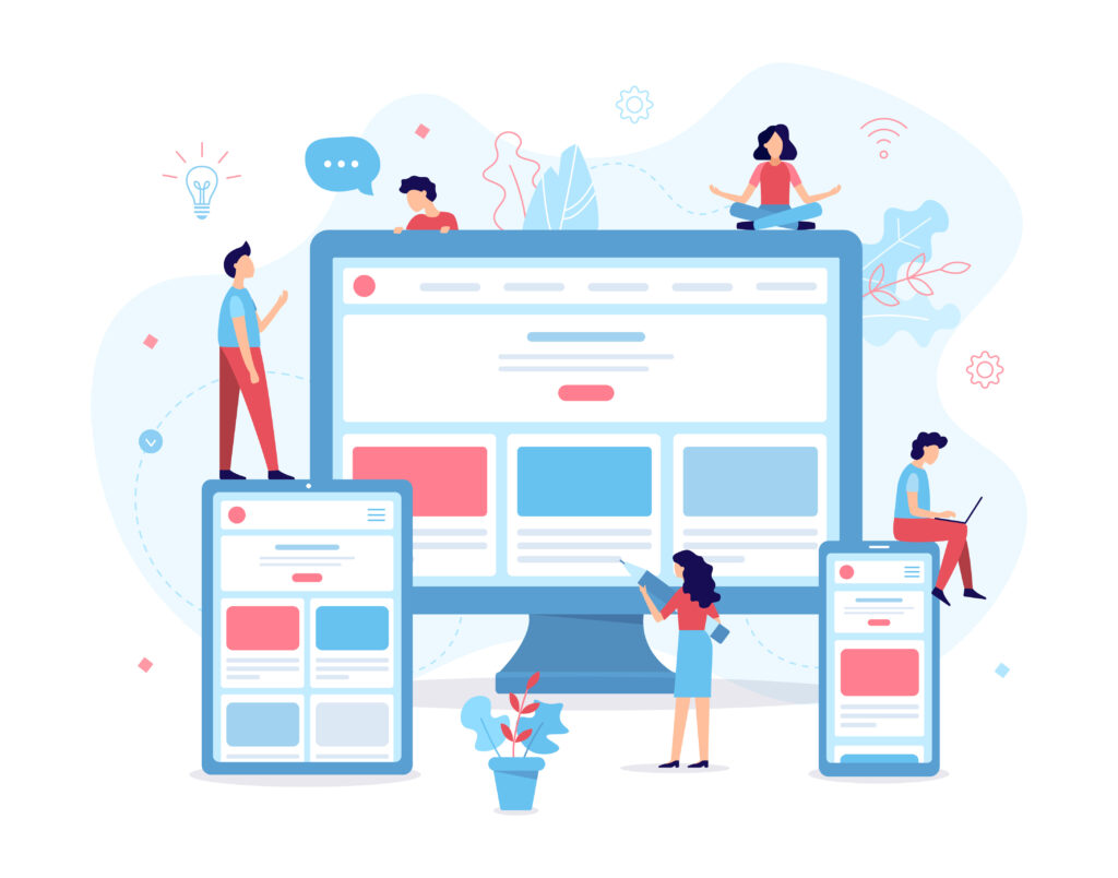
Responsive web design is a modern approach to web design, ensuring the site will display correctly and adapt to devices of all sizes with only one design model rather than a new separate design for each device. In this blog, we’ll be delving into the importance of responsive design, exploring best practices, tools, and techniques, and discussing how it enhances user experience (UX) and positively impacts your business.
Significance of Responsive Web Design:
The digital landscape has evolved, and so have user expectations. Responsive web design ensures that websites dynamically adapt to various screen sizes, resolutions, and orientations, providing users with a consistent and seamless experience. Responsive web design is not just the automatic resizing of the website but a different way of thinking about design with your client’s user experience in mind. This adaptability is crucial for users to switch between devices effortlessly, directly impacting user engagement, bounce rates, and overall satisfaction of your website.
Best Practices, Tools, and Techniques:
- Fluid Grids and Flexible Images:
- Utilize fluid grids that adapt to different screen sizes and ensure images are flexible. This approach entails scaling appropriately without compromising quality. Employing responsive images and flexible typography that adjusts based on the device’s capabilities and screen size will enhance your site’s performance and contribute to a visually pleasing and well-optimized design. Using these elements will help maintain a harmonious layout regardless of the device.
- Mobile-First Approach & Content Prioritization:
- When working on your site, keeping the design for mobile devices first and then enhancing it for larger screens ensures a streamlined and efficient design process. This approach prioritizes functionality for smaller screens and then adds complexity for larger displays. You should also keep this process in mind for content. Focusing on mobile-first content prevents you from compromising any essential information you may have included on the overall desktop design when it gets scaled down for smaller devices. Prioritizing content based on importance and relevance ensures that users on smaller screens receive the most critical information first.
- Minimalism
- Minimalism goes hand-in-hand with a mobile-first approach. You want simple graphics that will read well on mobile devices and large clickable buttons for your customers to engage with. Focusing on a minimalist design with smaller mobile devices will only benefit you as your design expands to larger screens, preventing stretched graphics or banners from gumming up your sleek design.
Good UI Enhancing Experience:
A good User Interface (UI) is essential to a positive user experience. It must be clean, responsive, and consistent across all platforms. When approaching the UI, a minimalist and responsive style can help ensure that your content is absorbed well by your viewers in this high-speed world and improve your load times, accessibility, and site flexibility.
Responsive design allows for this kind of enhanced usability experience. Simplified and intuitive navigation, adapting menu structures and layouts for different devices and ensuring users can easily find what they want. Responsive design also facilitates the seamless transfer of brand elements, ensuring a cohesive and professional appearance and that your brand identity remains consistent across devices.
Responsive web design is not merely a trend; it is a necessity in the dynamic digital landscape. By embracing the significance of responsiveness and adhering to best practices, utilizing tools, and incorporating adaptive design techniques, developers and designers can create websites that offer a consistent and delightful user experience across a spectrum of devices for business owners. In doing so, they contribute to the success of their websites by keeping pace with user expectations and the ever-evolving digital ecosystem.