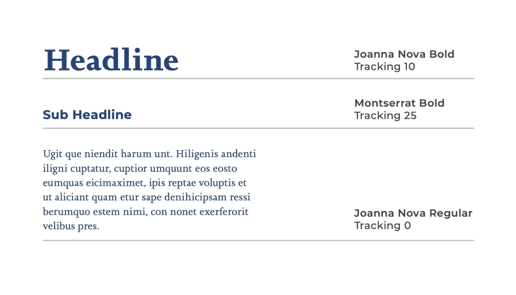
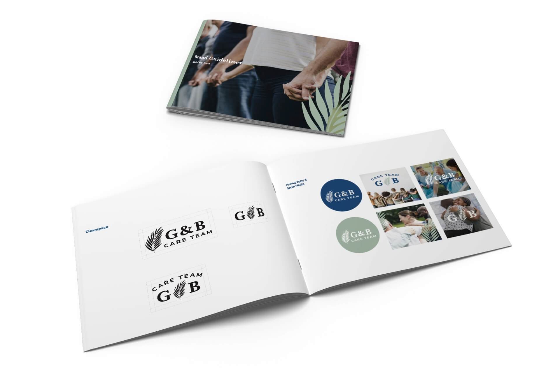
With the creation of a branch for their business, which is exclusively dedicated to community service and giving back, Guest and Brady Law firm tasked us with designing the look for this new expansion. A good choice when keeping your brand identifiable is to keep your colors similar, so we made a slight change to modernize them with more muted greens and blues. They asked to use a palm leaf in the design for its religious significance since they keep their faith at the forefront of their values and business, and so included a fitting image with the modernized font pairing for their logo. After our work, we created a brand guideline booklet for them, explaining how to use their new brand and logo and the color and font choices for its continued success