Project Description
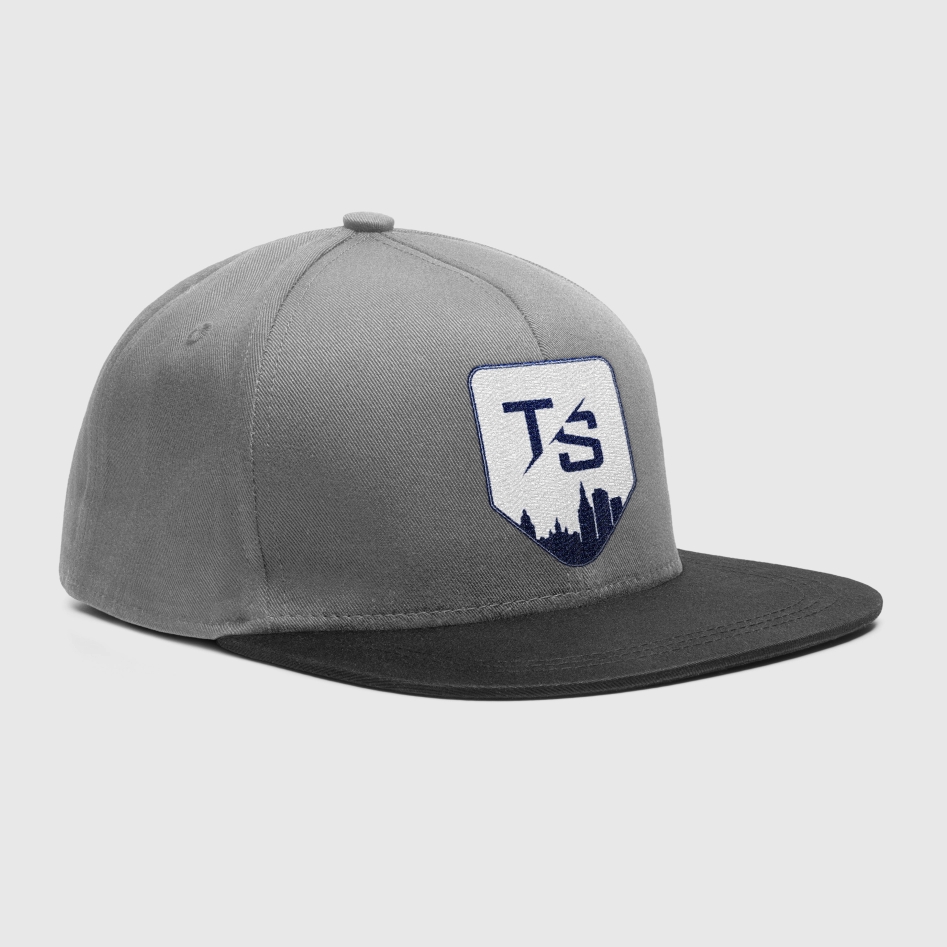
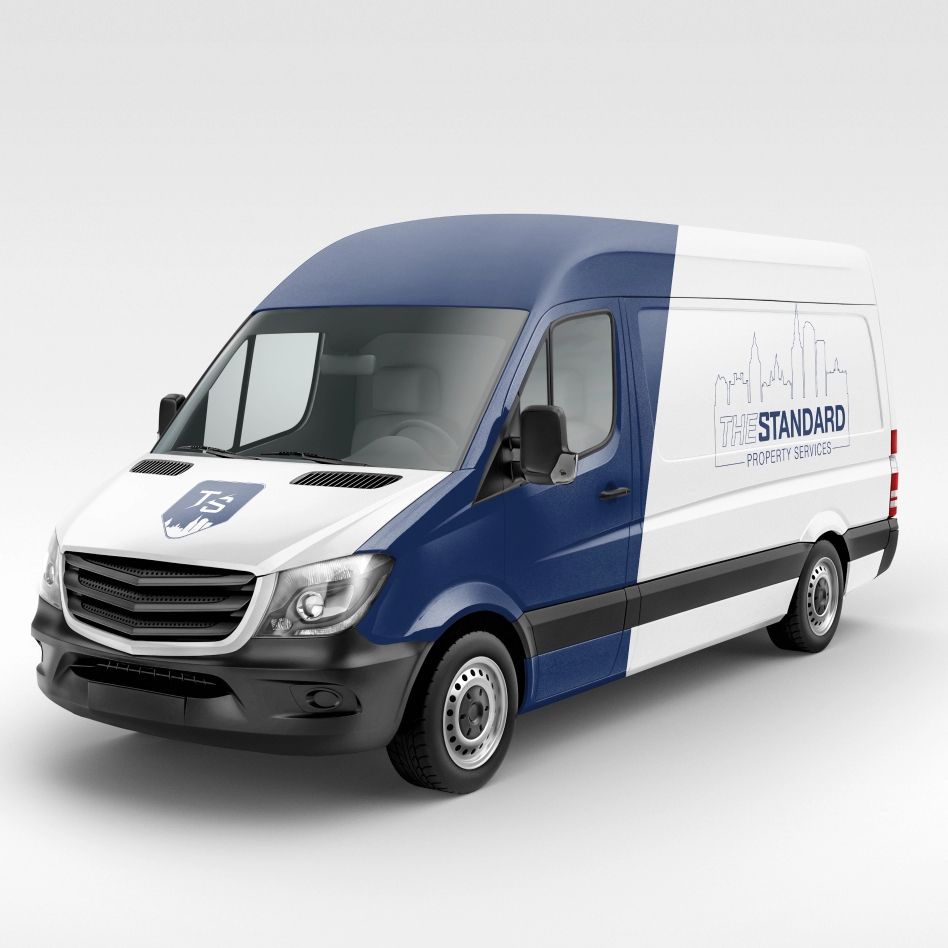
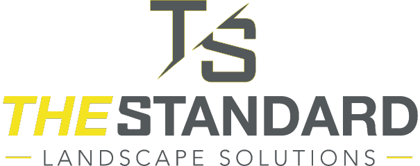
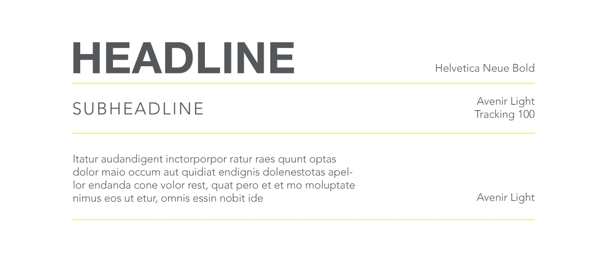
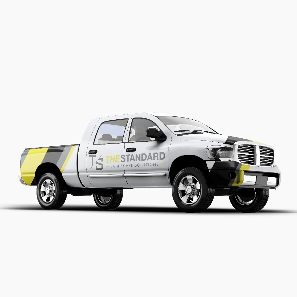
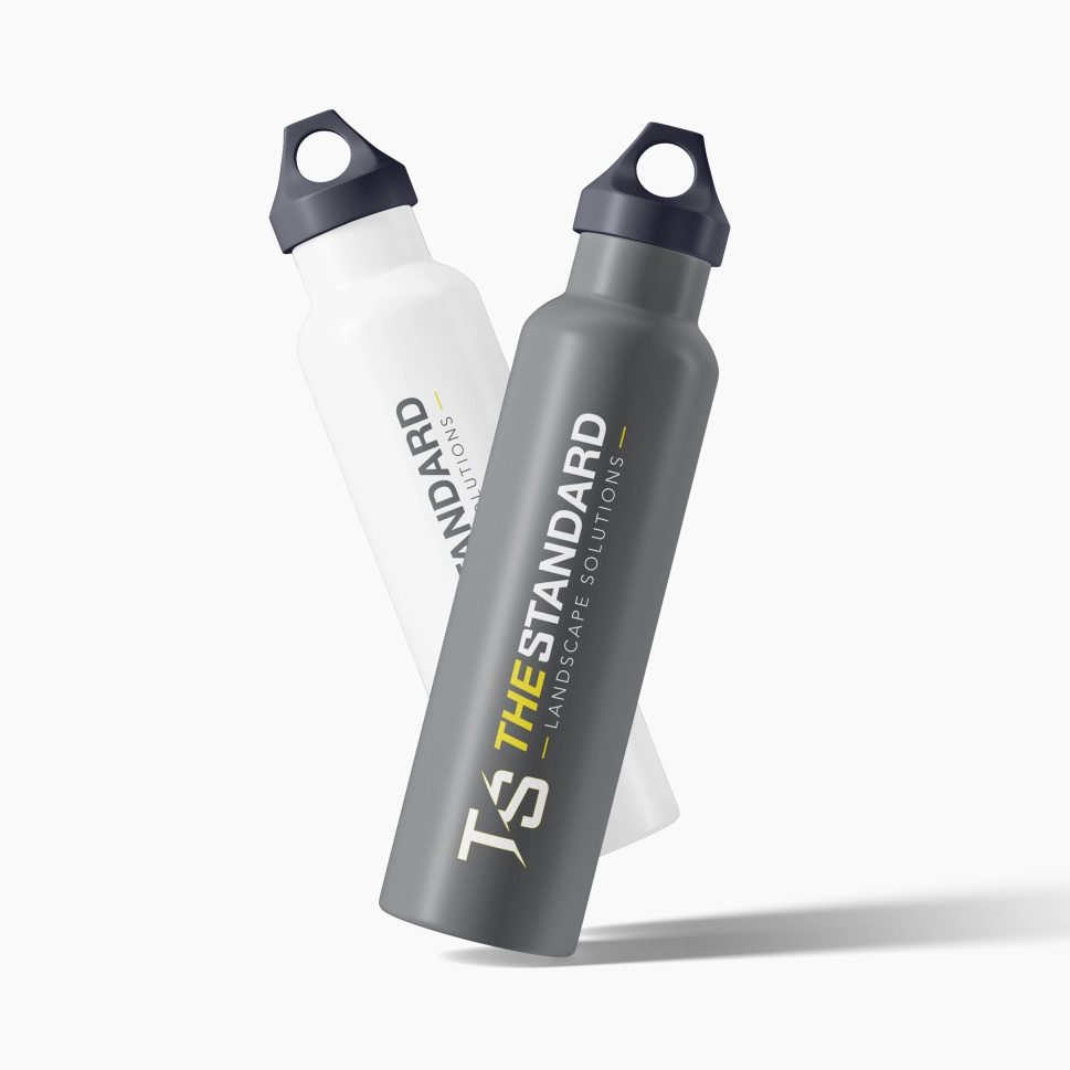
The Standard Landscape Solutions was searching for a new branding image that could easily translate from their work trucks to logos on a work polo or hat with their business’ initials. They wanted to use bright yellow since that had been a feature color of their brand since its start, and were looking for something to communicate their fast-acting, quality service. With this in mind, our design team implemented the yellow, used deep grays and blacks to balance out the brightness of the color, and used the sharp color to highlight their name as “The” standard when it comes to landscaping. Taking the initials and adding the contemporary forward angling font and lines accomplished their goal of communicating their service was efficient and fast-acting as soon as you laid eyes on the design.
LOGO DESIGN

COLOR SCHEME
TYPOGRAPHY STYLES
REAL LIFE APPLICATION
LOGO DESIGN

COLOR SCHEME
TYPOGRAPHY STYLES

REAL LIFE APPLICATION
